Setting & Setting group
DevToys has an API to support settings. Settings are often simple values that are persisted on the hard drive so DevToys can restore their state after restarting. See Use settings for more information.
You can display a setting card using the Setting() or SettingGroup() static methods, which produces a IUISetting or IUISettingGroup. Each of these controls can handle settings automatically, simplifying the support of bool and Enum settings.
The main difference between these two UI element is that a SettingGroup is expandable, can display children Setting, and can display a summary of the state of the children settings thanks to StateDescription.
Both SettingGroup and Setting component can handle settings automatically using their Handle extension methods.
Sample
using DevToys.Api;
using System.ComponentModel.Composition;
using static DevToys.Api.GUI;

namespace MyProject;

[Export(typeof(IGuiTool))]
[Name("My Tool")]
[ToolDisplayInformation(
    IconFontName = "FluentSystemIcons",
    IconGlyph = '\uE670',
    ResourceManagerAssemblyIdentifier = nameof(MyResourceAssemblyIdentifier),
    ResourceManagerBaseName = "MyProject.Strings",
    ShortDisplayTitleResourceName = nameof(Strings.ShortDisplayTitle),
    DescriptionResourceName = nameof(Strings.Description),
    GroupName = "My Group")]
internal sealed class MyGuiTool : IGuiTool
{
    private static readonly SettingDefinition<bool> firstOption
        = new(
            name: $"{nameof(MyGuiTool)}.{nameof(firstOption)}",
            defaultValue: false);

    private static readonly SettingDefinition<bool> secondOption
        = new(
            name: $"{nameof(MyGuiTool)}.{nameof(secondOption)}",
            defaultValue: true);

    private enum Fruit
    {
        Banana,
        Strawberry,
        Apple
    }

    private static readonly SettingDefinition<Fruit> thirdOption
        = new(
            name: $"{nameof(MyGuiTool)}.{nameof(thirdOption)}",
            defaultValue: Fruit.Banana);

    [Import]
    private ISettingsProvider _settingsProvider = null!;

    private readonly IUISetting _thirdOptionUISetting = Setting();

    public UIToolView View
        => new UIToolView(
            Stack()
                .Vertical()
                .WithChildren(
                    SettingGroup()
                        .Title("First options group")
                        .Handle(_settingsProvider, firstOption, OnFirstOptionChanged) // This will automatically display a Toggle Switch because `firstOption` is a boolean option.
                        .Icon("FluentSystemIcons", '\uE670')
                        .WithSettings(

                            Setting()
                                .Title("Second Option")
                                .Description("This is the second option.")
                                .Handle(
                                    _settingsProvider,
                                    secondOption, // This will automatically display a Toggle Switch because `secondOption` is a boolean option.
                                    stateDescriptionWhenOn: "Second option is on",
                                    stateDescriptionWhenOff: "Second option is off",
                                    OnSecondOptionChanged),

                            _thirdOptionUISetting
                                .Title("Third Option")
                                .Description("This is the third option.")
                                .Handle(
                                    _settingsProvider,
                                    thirdOption, // This will automatically display a Select Drop Down List because `thirdOption` is an enumeration option.
                                    OnThirdOptionChanged,
                                    Item("A banana", Fruit.Banana),
                                    Item("A strawberry", Fruit.Strawberry),
                                    Item("An apple", Fruit.Apple)),

                            Setting()
                                .Title("Fourth Option")
                                .Description("This is the fourth option.")
                                .InteractiveElement( // Here, we do not handle a setting automatically. Instead, we display a custom UI element.
                                    Button().Text("Click me"))),

                    SettingGroup()
                        .Title("Second options group")
                        .Description("This is the second options group.")
                        .Icon("FluentSystemIcons", '\uE670')
                        .WithChildren( // Here, we use `WithChildren` instead of `WithSettings`, which allows us to display any kind of UI element.
                            Button().Text("Click me"))));

    public void OnDataReceived(string dataTypeName, object? parsedData)
    {
        // Handle Smart Detection.
    }

    private void OnFirstOptionChanged(bool isOn)
    {
    }

    private void OnSecondOptionChanged(bool isOn)
    {
    }

    private void OnThirdOptionChanged(Fruit optionValue)
    {
        _thirdOptionUISetting.StateDescription($"we selected the {optionValue} fruit");
    }
}
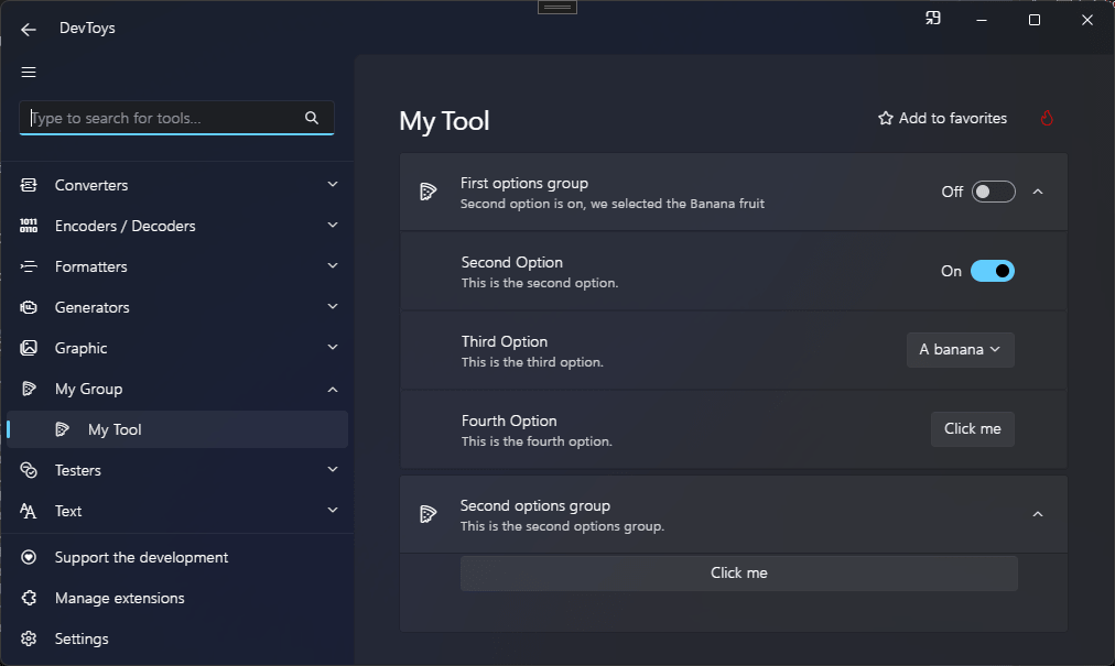
The code above produces the following UI: